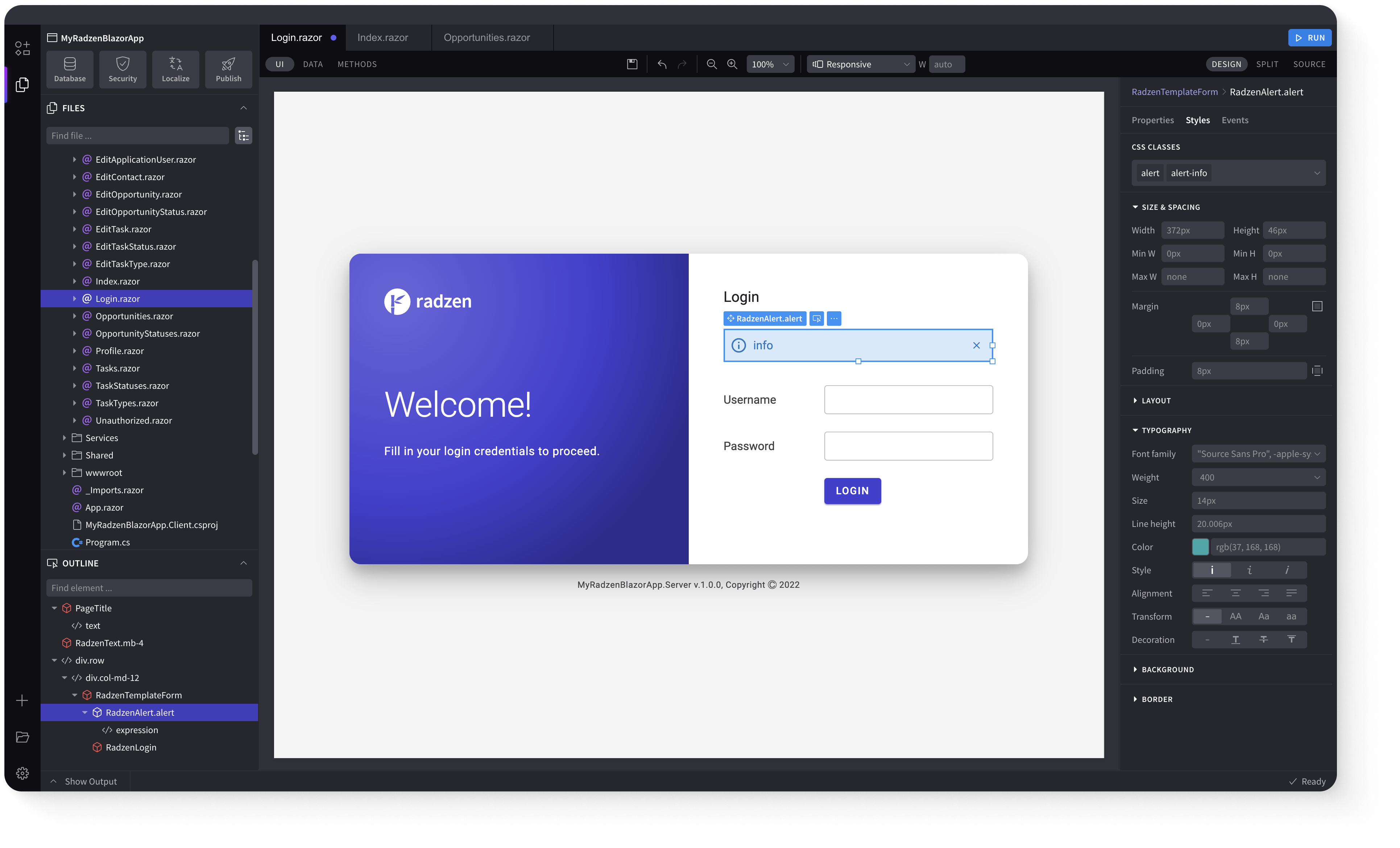
DropDownDataGrid
Demonstration and configuration of the Radzen Blazor DropDownDataGrid component.
Get and Set the value of DropDownDataGrid link
As all Radzen Blazor input components the DropDownDataGrid has a Value property which gets and sets the value of the component. Use @bind-Value to get the user input.
Around the Horn
Get and Set the value of DropDownDataGrid using Value and Change event link
Value property can be used to set the value of the component and Change event to get the user input.
Around the Horn
Define Text and Value properties link
Around the Horn
DropDownDataGrid with custom header, footer, value and item templates link
Company: Around the Horn
Define multiple columns link
Around the Horn
Filtering case sensitivity and filter operator link
Custom filtering with LoadData event link
Multiple selection link
Alfreds Futterkiste
Around the Horn
DropDownDataGrid virtualization with IQueryable event link
DropDownDataGrid virtualization with LoadData event link
Control DropDown's DataGrid Density with Density parameter link
Around the Horn
DropDownDataGrid binding to dynamic data link
Keyboard Navigation link
The following keys or key combinations provide a way for users to navigate and interact with Radzen Blazor DropDownDataGrid component.
| Press this key | To do this |
|---|---|
| Tab | Navigate to a DropDownDataGrid. |
| Alt + DownArrow | Open DropDownDataGrid popup. |
| DownArrow on closed popup | Select next DropDownDataGrid item. |
| UpArrow on closed popup | Select previous DropDownDataGrid item. |
| DownArrow in an opened popup | Focus next DropDownDataGrid item. |
| UpArrow in an opened popup | Focus previous DropDownDataGrid item. |
| LeftArrow in an opened popup | Goes to previous DropDownDataGrid page. |
| RightArrow in an opened popup | Goes to next DropDownDataGrid page. |
| Enter in an opened popup | Select the focused DropDownDataGrid item and close the popup. |
| Esc or Alt + DownArrow in an opened popup | Close the DropDownDataGrid popup. |
Radzen Blazor Components, © 2018-2025 Radzen.
Source Code licensed under
MIT