Accessibility
Radzen Blazor Components library prioritizes accessibility for all users by adhering to the highest levels of web accessibility guidelines and recommendations. It can help you make your Blazor app accessible and compliant with WAI-ARIA, WCAG 2.2, Section 508, and keyboard compatibility standards.
Applying guidelines link
While the components cover various accessibility standards to provide an inclusive user experience out of the box, inappropriate positioning or component configurations might lead to barriers such as low contrast between text and background colors, small text, empty or missing labels, etc. In addition, different standards and accessibility levels of conformance have different success criteria. All this introduces the need to always be aware and test your layouts, content, and component configurations against the desired accessibility guidelines.
Read more about testing and evaluating web accessibility on the World Wide Web Consortium (W3C) website.
WCAG 2.2 link
WCAG stands for Web Content Accessibility Guidelines - an internationally recognized set of recommendations for making web content more accessible. The latest WCAG 2.2 is the recommended specification by (W3C) since October 5, 2023.
See How to Meet WCAG (Quick Reference).
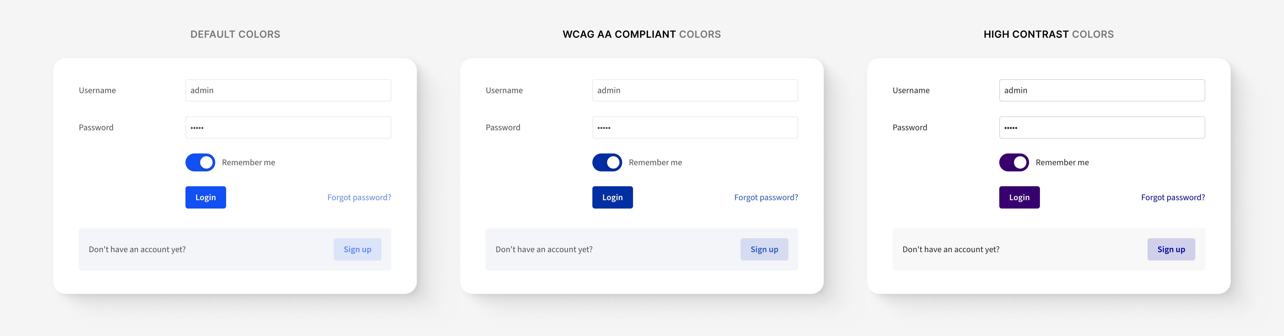
WCAG compliant theme colors (AA level of conformance) link
The Radzen.Blazor library contains a set of complementary WCAG AA compliant color sets for each one of the available themes.
Preview
To preview the colors in the demos, enable the "Use WCAG compliant colors" option in the demos configuration.
Usage
To use the colors in your apps, include the [theme]-wcag.css file right after the [theme]-base.css:
<link rel="stylesheet" href="_content/Radzen.Blazor/css/standard-base.css">
<link rel="stylesheet" href="_content/Radzen.Blazor/css/standard-wcag.css"> <!-- Load WCAG 2.2 AA compliant colors -->
High Contrast theme colors PROlink
Higher contrast makes app content easier to look at and quicker to read.
ARIA attributes link
Radzen.Blazor leverages Accessible Rich Internet Applications (ARIA) attributes to enhance the accessibility of the components. ARIA attributes provide additional information to assistive technologies, making complex widgets and interactions more understandable and navigable for users with disabilities.
See ARIA Authoring Practices Guide (APG).
Semantic HTML link
Radzen.Blazor prioritizes the use of semantic HTML elements to ensure proper document structure and meaningful markup. Semantic HTML helps screen readers and other assistive technologies understand the content and navigate through it more efficiently.
Screen reader compatibility link
Radzen.Blazor provides appropriate labels, roles, and descriptions to enable screen reader users to understand and interact with the components effectively.
Responsive design link
The components are designed to be responsive and adaptable to different screen sizes and devices. Accessibility features remain intact across various breakpoints, enabling users to access and use the components seamlessly on desktops, tablets, and mobile devices.
Keyboard compatibility link
Keyboard compatibility implies that all application functionality must be usable with the keyboard without any focus traps, allowing the user to freely move across the application via only a keyboard interface.
Focus management
Focus states are carefully managed to ensure that keyboard users can easily identify which element has focus as they navigate through the components. Clear and consistent focus styles are applied to interactive elements to enhance usability and accessibility.
Keyboard navigation with Radzen Blazor Components
The following is a list of the common key shortcuts to navigate and interact with Radzen Blazor Components.
| Press this key | To do this |
|---|---|
| Tab | Focus next UI element. |
| Shift + Tab | Focus previous UI element. |
| Arrow keys in a focused complex component | Focus subcomponents. |
| Space or Enter | Toggle component's state or navigate. |
| Esc | Close or collapse a component. |
Accessibility Conformance Report (ACR) link
Radzen Blazor Components ACR is based on an ITI VPAT® format covering Section 508 (U.S.), EN 301 549 (EU), and W3C/WAI WCAG.
The use of Radzen Blazor Components does not constitute and guarantee that the end-user software will be compliant with accessibility standards and guidelines. The components provide means to developers to cover the required accessibility criteria and functionalities.
Download Radzen Blazor Components VPAT
Radzen Blazor Components, © 2018-2025 Radzen.
Source Code licensed under
MIT